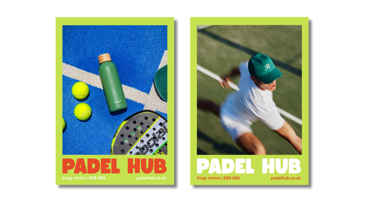
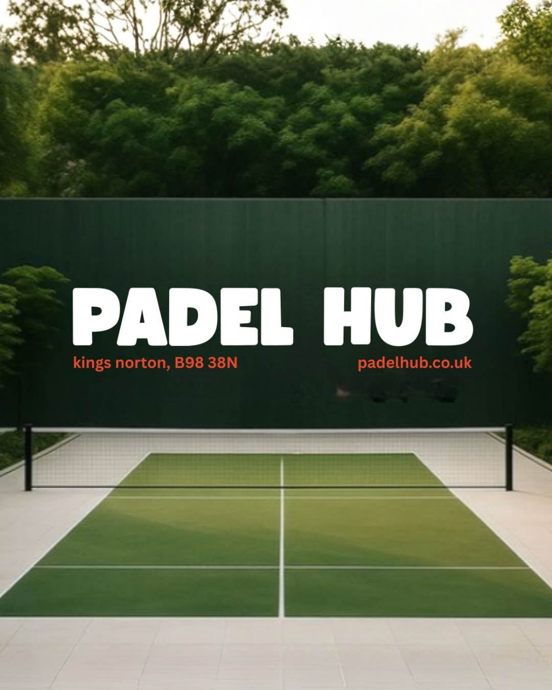
Padel Hub
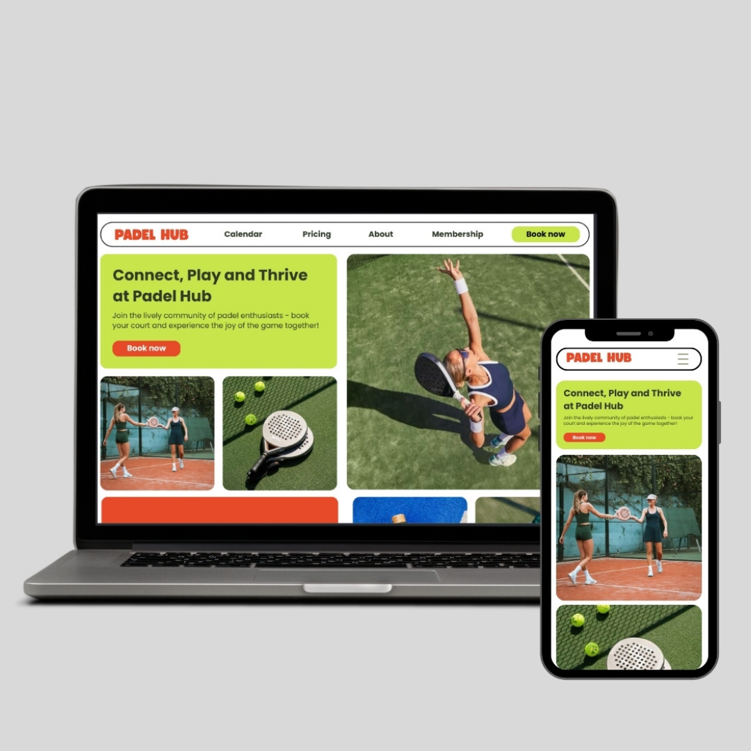
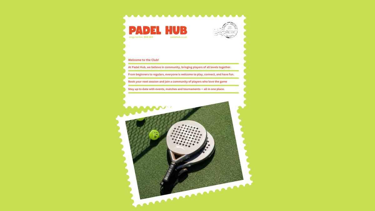
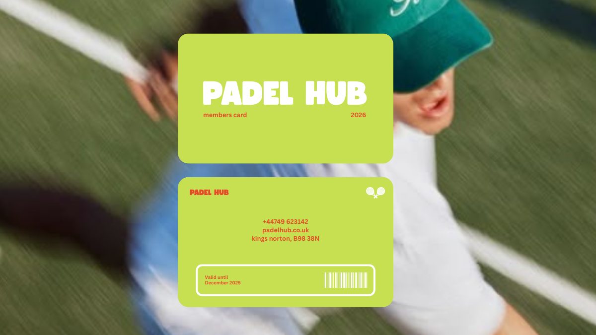
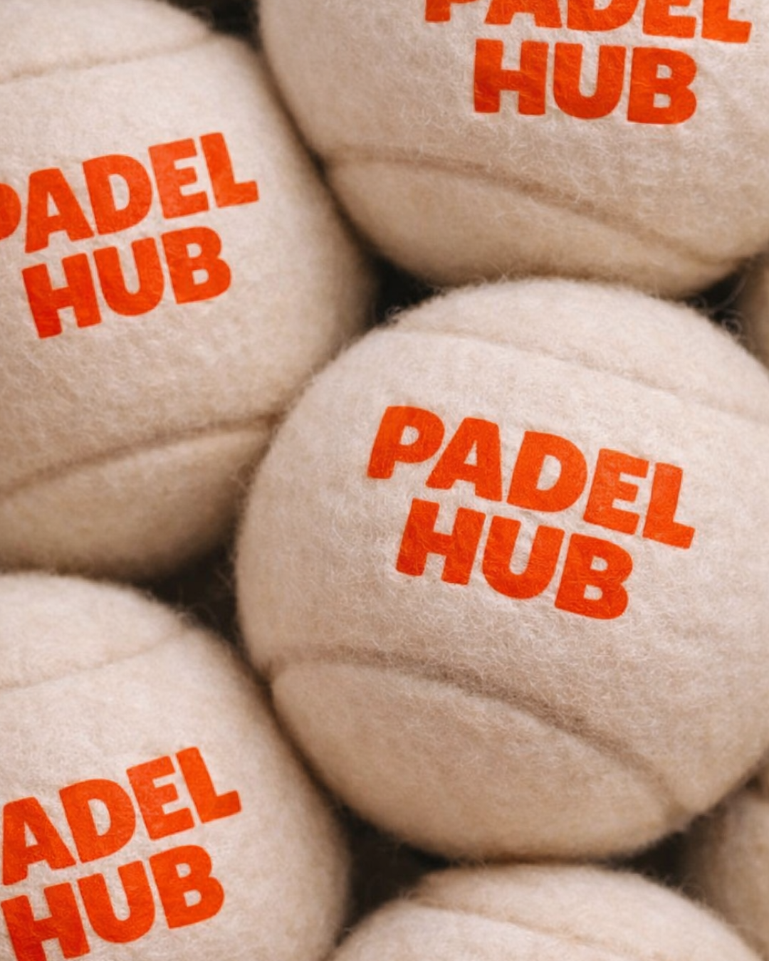
For Padel Hub, the brief was to build a brand and website that felt energetic, modern, and welcoming, something that matched the energy of padel itself. I chose bright, bold colours like green and orange to bring that feeling to life and make the brand instantly recognisable.
The challenge was to combine these vibrant visuals with a site that was easy to use and navigate, so players could quickly find events, book sessions, and join the community without confusion. I needed to balance a strong visual identity with smooth, user‑friendly design so the project would feel both exciting and accessible to everyone, whether they’re new to padel or regular players.
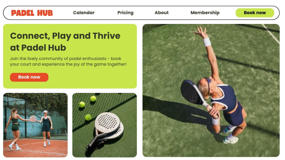
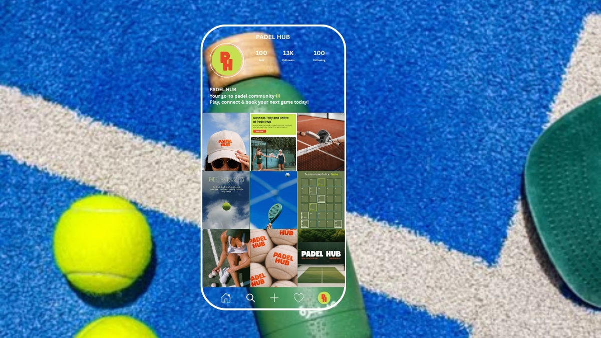
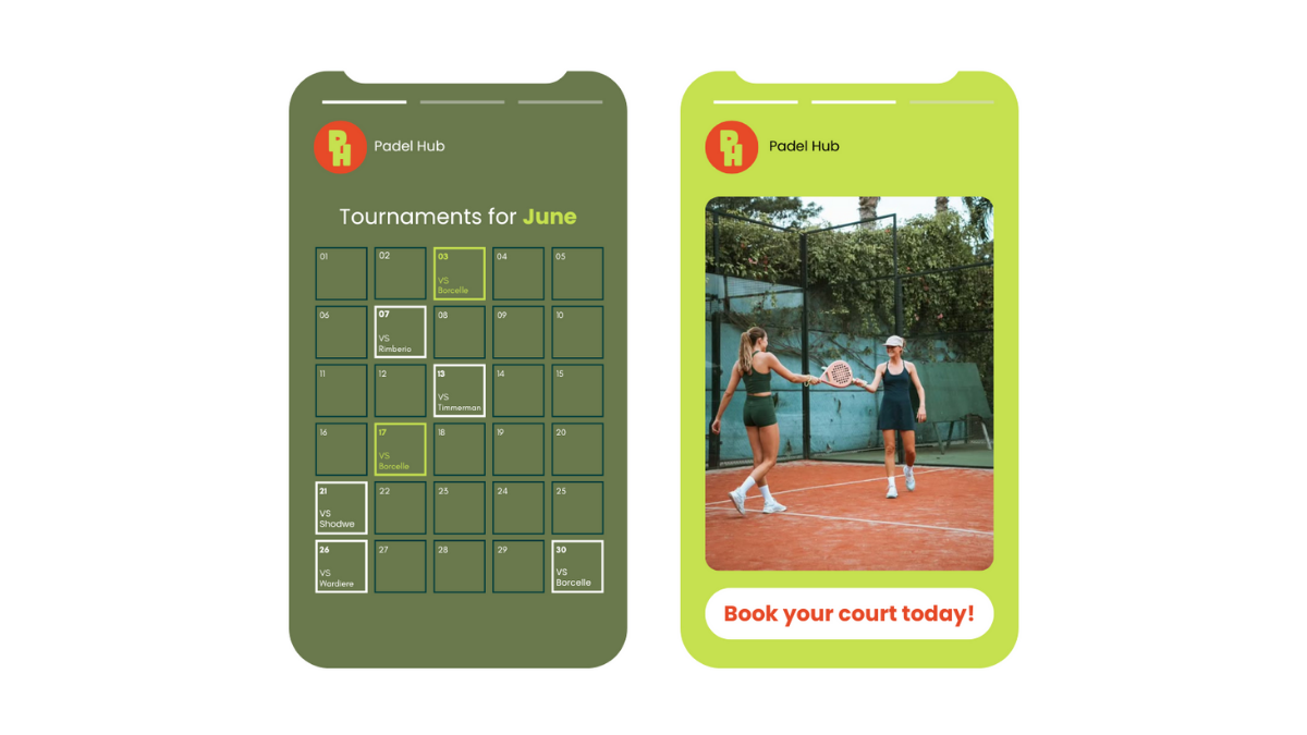
The finished project delivers a bold, cohesive brand identity and a website that’s easy to navigate, visually engaging and accessible to everyone. Users can quickly explore events, book sessions, and connect with the community. The design reflects the energy of Padel Hub, helping the brand stand out and engage players at every level.