Whipped Moisturiser
Whipped is a skincare brand built around softness, hydration, and a light, airy feel.
The challenge was to create a visual identity that clearly showed this “whipped” texture, while still feeling calm, clean, and premium.
The brand needed to stand out in a crowded skincare market without feeling too clinical or too playful. Everything had to feel gentle, comforting, and easy to trust, both on the website and on social media.
.png)
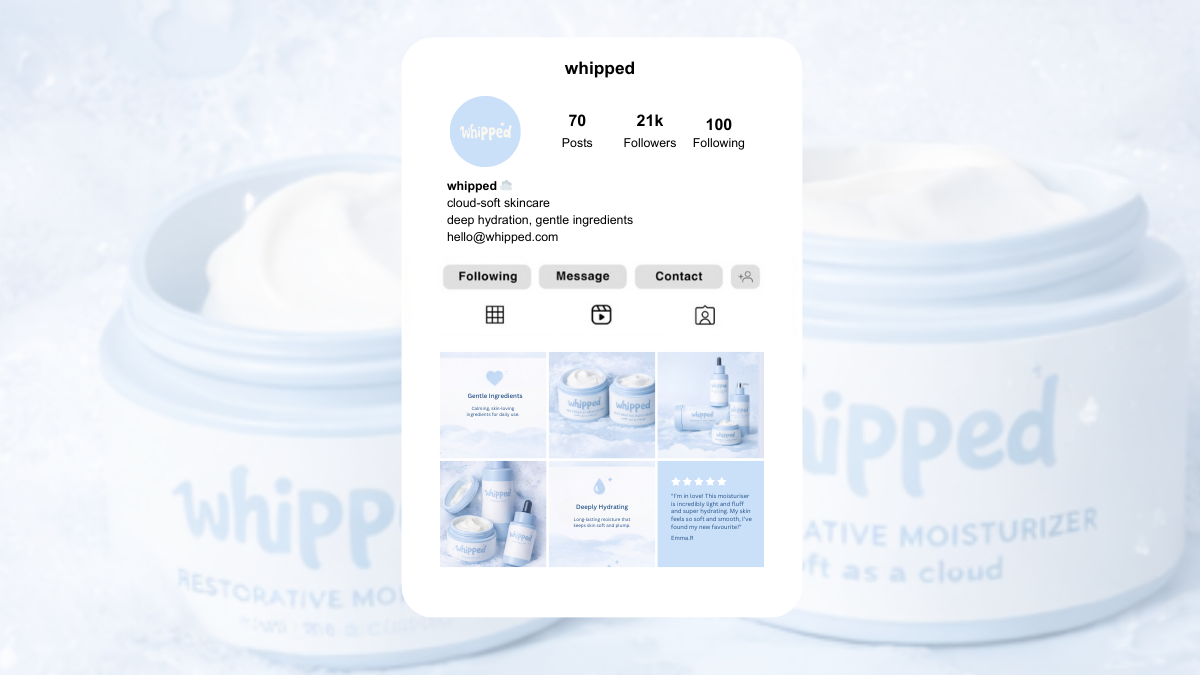
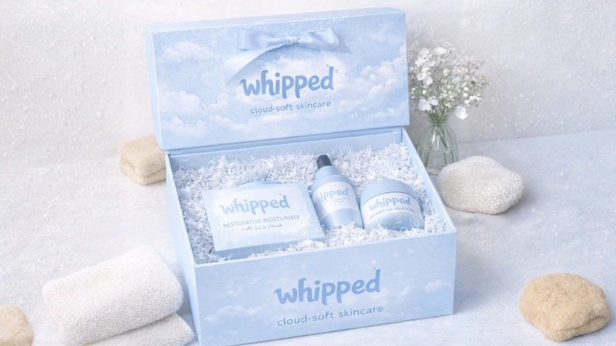
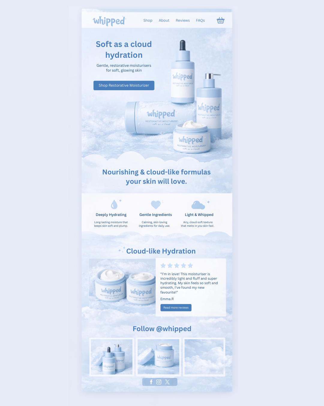
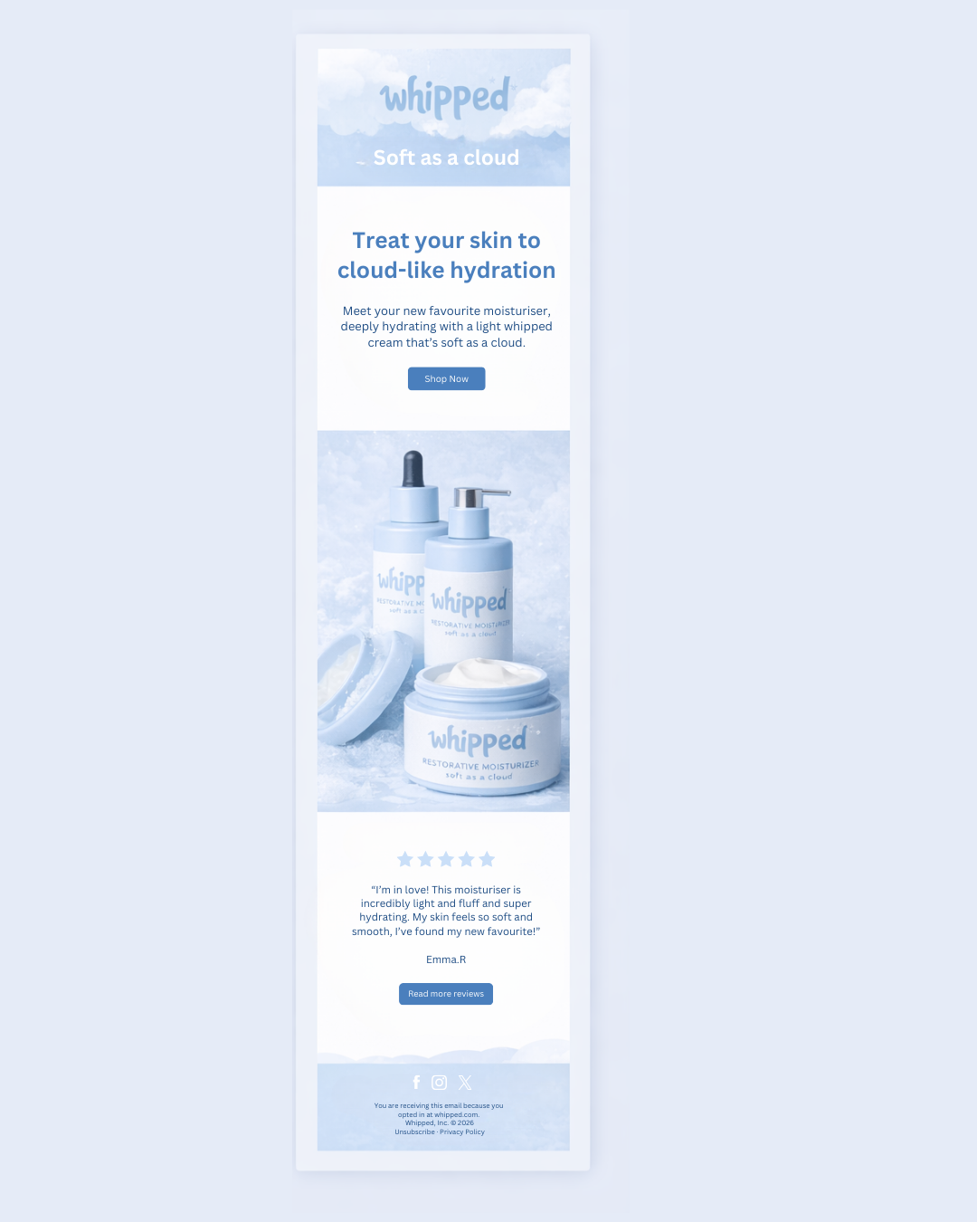
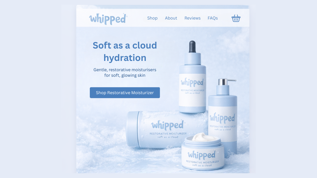
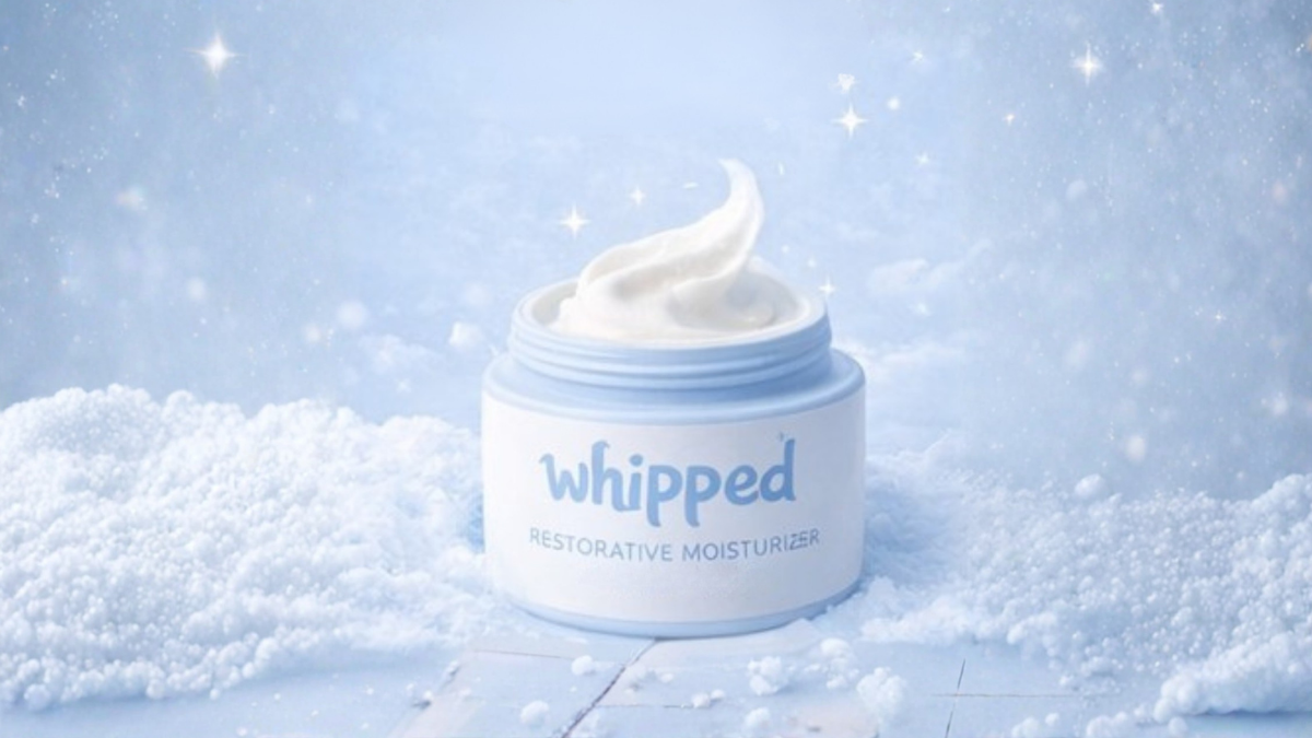
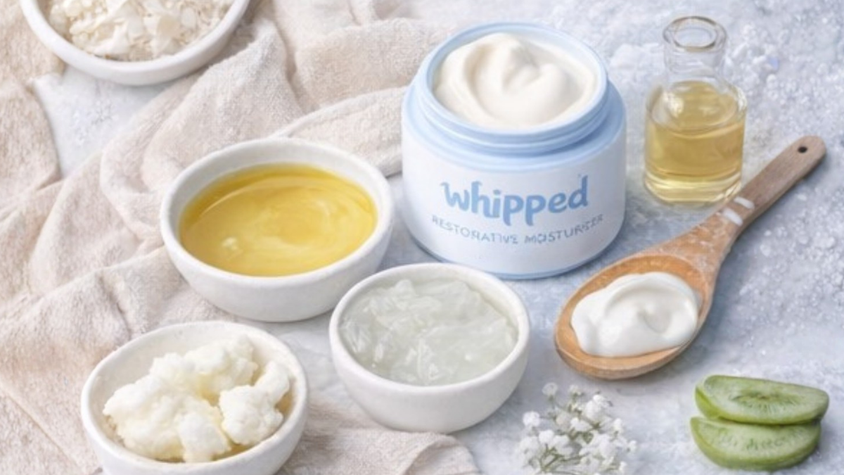
The final design feels light, soft and cloud-like, matching the product texture and brand name.
Soft blue colours, clean layouts and texture-focused imagery help communicate hydration and gentleness at a glance. The brand works consistently across the website, social media and marketing materials.
It feels calm, modern and inviting, helping Whipped feel like a skincare brand people want to use every day.